Line Charts
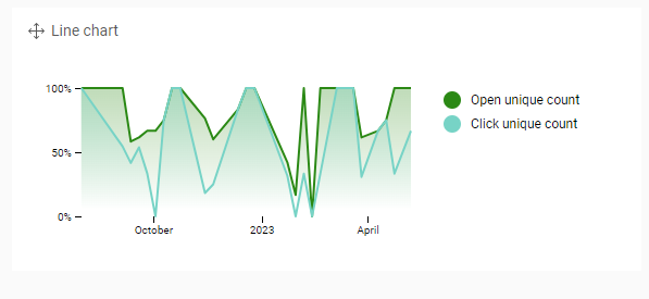
Line charts are mostly used to show trends and outliers over time. Time is represented by position on the horizontal x-axis. The measure(s) are shown on the vertical y-axis.
A grouped line chart can be created starting with a line chart.
When to use
- Visualize a trend or identify outliers
- Visualize and compare (grouped line) continuous data.
- Best practice: adjust the granularity depending on the amount of measure points. For example, when looking over a year, it could be better to display weeks or months rather than days.
